Introduction to Probability and Statistics for Engineers
The goal of statistics is to study (quantify) random variation. Variables are either systematic or random. For a given variable, if its sources of variation are known, controllable, and measurable, it is considered a systematic variable; i.e., its values may be predicted using mathematical modeling. On the other hand, if one of these three conditions are violated, the resulting variable will be random, and its values cannot be predicted accurately. In this case, the statistical approach is to observe the possible values of the random variable through a planned experiment that is replicated until all possible sources of variation are covered. These experiments can be run to produce a collection of data on all elements of a population about which we wish to draw a conclusion. However, if the population is too large, or the experiment is expensive or destructive, we usually run the experiment over a subset of the population which we call a sample. When the outcome of the experiment is measured, the results are numerical data. However, if the outcome of the experiment is descriptive, the results are called attribute data. As an example, consider the population consisting of all the shoes produced by a manufacturer. If we are interested in the shoes size, the results are numerical data. On the other hand, if we are interested in the shoes color, the results will be attribute data.
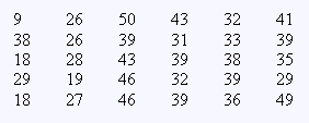
To explain some of the concepts of statistics, we will consider the number of students, in a class of 50 who will show up for class on a given day (call it X) as an example. This is clearly a variable because it will change from day to day. if we decided that it is a variable, we should be able to list some sources of variation. These may include: emergencies (sickness, accident, delays, etc.), an intimidating instructor, an interesting football game at the same time of the class, homework not done, exam day, dropped the course, etc. Obviously many of these factors are uncontrollable resulting in a random variable. Statistical methods will be used to study X. The population of interest here is all class-days (past, present, and future) which obviously cannot be observed in its entirety, and sampling is needed. So, we decide to observe X over a period, long enough to cover all possible sources of variation. Assume that we observed the attendance over 30 class-days and collected the following data:
In statistics, these data (the observed values of the random variable X) can be used to characterize the random variable X, by defining a range over which it varies (9-50), dividing that into suitable sub-ranges, and finding the frequency of observing X in each sub-range. We may also divide these frequencies by the total number of observations to get the relative frequency of observing X in each sub-range, or equivalently, the probability of observing X in each sub-range. This is where probability and statistics combine together to address the goal of quantifying random variation.
In brief, in probability and statistics, we quantify a random variable by 1) defining its range of variation, and 2) defining the probability that the random variable will fall in any sub-range of the defined range. As we will see later, this may be achieved without the need for experimentation.
Turning our attention back to the random variable X (the number of students attending class on a given day), we may present the collected data in two ways: numerically, and graphically.
Numerical presentation seeks to abbreviate the data by
calculating or finding measures which characterize the
data. These measures are of two types: measure of
center and measure of variation (dispersion).
Measures of center include the mean( ![]() ) , median
(
) , median
( ![]() ) and
mode. The mean is the arithmetic average of the
data, formally defined as
) and
mode. The mean is the arithmetic average of the
data, formally defined as
 ,
,
, where n is the 30 in our example. The median is the
middle point of the ordered data. The mode is the most frequently
repeated data value. In our
example , ![]() =34,
=34,
![]() =35.5, mode = 39.
=35.5, mode = 39.
Measures of variation include, the range ( R ), variance (S2), and standard deviation (S). The range is the difference between the maximum and minimum observed values. The variance is defined as :
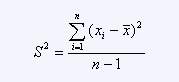
The standard deviation S is just the square root of the variance.
In our example, R = 41, S2 = 94.69, and S=9.73.
Graphical data presentation seeks to display the characteristics of the data in graphical way. Our discussion will cover stem-and-leaf plots, frequency/relative frequency histograms, and box plots.
To construct a histogram, we divide the data range into sub-ranges, called classes, and the frequency of data in each class is counted. The number of classes (sub-ranges) is chosen to be close to the square root of n (the number of data points), and between 5 and 20 inclusive. In our example, we will use 6 classes to construct the following frequency distribution table:
| Class Interval | Tally | Frequency | Relative Frequency | Cumulative Relative Frequency |
| 9 £ X < 16 16 £ X < 23 23 £ X < 30 30 £ X < 37 37 £ X < 44 44 £ X < 51 |
/ /// //// |
1 3 6 6 10 4 |
0.03 0.10 0.20 0.20 0.33 0.14 |
0.03 0.13 0.33 0.53 0.86 1.00 |
| 30 | 1.00 |
Using the horizontal axis to represent the measurement scale, and the vertical axis to represent frequencies or relative frequencies, we can draw a histogram to provide a visual impression of the shape of distribution, as well as the dispersion of the data.
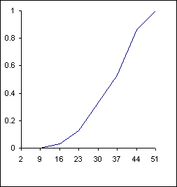
Cumulative Relative Frequency Plot |

Frequency Histogram |
To construct a stem-and-leaf plot, we divide each observation xi into two parts: a stem, consisting of one or more of the leading digits, and a leaf, consisting of the remaining digits. The plot shown below, on the left, is the stem-and-leaf plot for the data in our example.
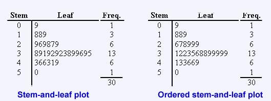
We may order the leaves on the stem-and-leaf plot to help in calculating different percentiles of the data including the median. The plot shown above, on the right, is an ordered stem-and-leaf plot for our data.
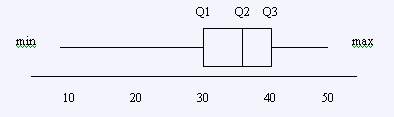
Finally, a box plot is a special plot which tries to
display data range/variability and the locations of its
center with respect to the range. It is of special
benefit in comparing data sets of related variables. To
construct the box plot, data are divided in quarters. The
first quartile (Q1) is the data point below which roughly
25% of all the data fall. The second quartile (Q2) is the
data point below which roughly 50% of the data fall, and
so forth. Of course, Q2 is just the median. The data
points used in constructing the box plot are the minimum, Q1,
Q2, Q3, and the maximum. The plot consists of a box
bounded by Q1 and Q3 with whiskers extending from Q1 to
the minimum and from Q3 to the maximum. Q2 is plotted as
a line inside the box. The distance from Q1 to Q3 is
called the inter-quartile range. To determine the various
Q's, the following rule is useful:
the rank of the ith
percentile = ( i/100)n + 0.5. For our class attendance
example, the rank of Q1 is (24/100)30 + 0.5 = 8. From the
ordered stem-and-leaf plot, Q1=29. Similarly, Q2=35.5, Q3=39.
The following is the box plot.
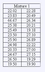
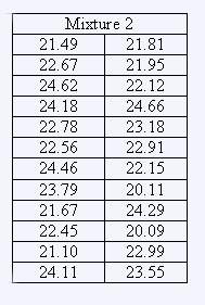
Example:
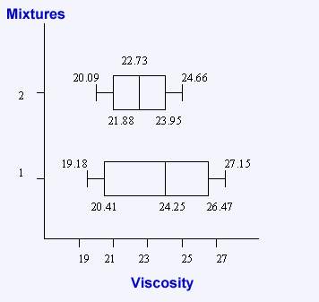
The viscosity measurements (in centipoise) for different mixtures are:
|
|
Solution:
a)
| MIxture 1 | Mixture 2 | |||
| Freq. | Leaf | Stem | Leaf | Freq. |
|
4 3 - 3 2 1 4 4 3 |
9 5 3 2 5 3 2 - 3 2 0 8 5 7 9 5 4 0 9 7 5 3 2 1 0 |
19 20 21 22 23 24 25 26 27 |
1 1 1 5 7 8 9 1 1 4 6 7 8 9 0 2 6 8 1 2 3 5 6 7 |
2 5 7 4 6 |
| 24 | 24 | |||
b)
Rank of Q1 = 25 / 100 x 24 + 0.5 = 6.5
Q2 = 50 / 100 x 24 + 0.5 = 12.5
Q3 = 75 / 100 x 24 + 0.5 = 18.5
MIXTURE 1
MIXTURE 2
Q1 = 20.41 Q2 = 24.25
Q3 = 26.42
Q1 = 21.88
Q2 = 22.73
Q3 = 23.95
Inter-quartile Range of:
MIXTURE 1 = Q3 - Q1 = 6.01
MIXTURE 2 = Q3 - Q1 = 2.07
Comments:
A Pareto diagram is a bar graph for count data. It displays the frequency of each count on the vertical axis and the count type classification on the horizontal axis. We always arrange the count types in descending order of frequency of occurrence.